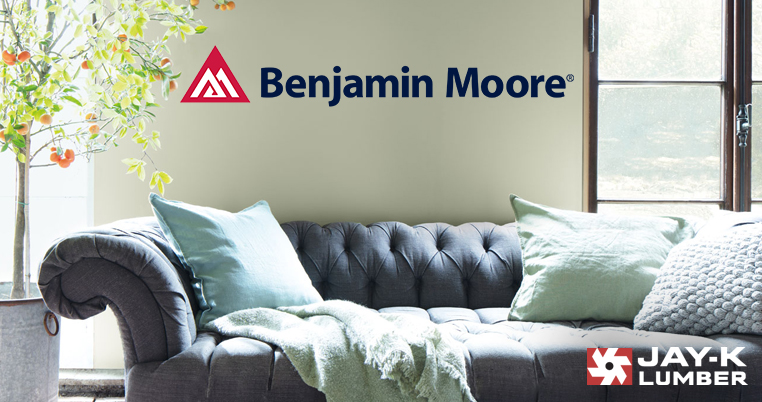
Paint Color Trends 2022
Adapted from Benjamin Moore’s Color Trends & Color of the Year 2022 article.
Top 14 Trending Colors
Get inspired with a sneak peek at next year’s top trending colors from our friends at Benjamin Moore. The Color Trends 2022 Palette is full of beautiful shades that can be used for any room and any project. Mix and match these color combinations to accentuate your home with calmness, comfort, and contentment.
The Color Trends 2022 Palette


Color of The Year
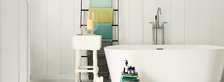
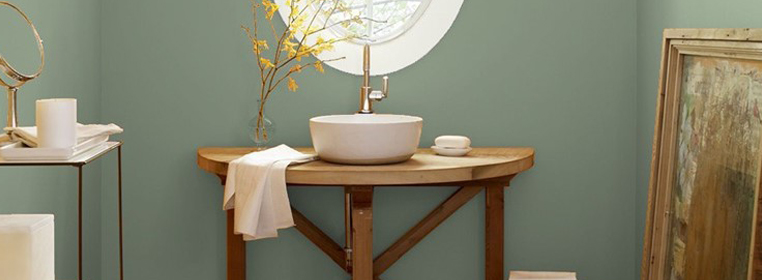
1. October Mist
1495
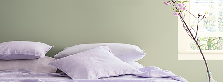
An alluring tone that works for any design project. Evocative of the stem of a flower, this gently shaded sage anchors and uplifts. October Mist creates a canvas for your imagination to blossom.
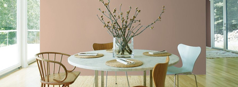
2. Wild Flower
2090-40
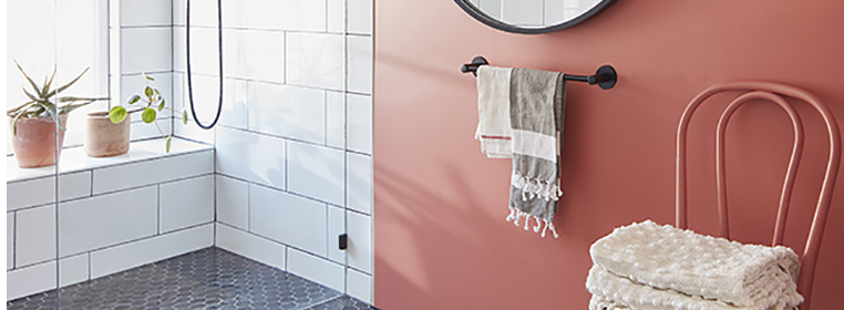
Lightly dusted with hints of pink and orange, this unique shade of red conveys effortless style. Wonderful for a subtle, yet bold statement to your room.
3. Pale Moon
OC-108
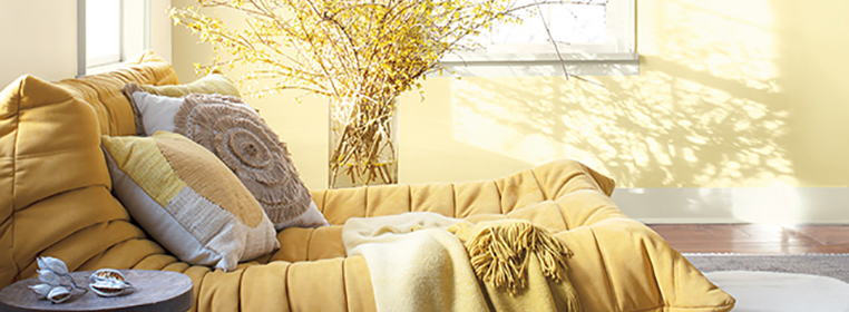
A classic soft yellow that can subtly accentuate any room. This hue adds a level of sophistication to your decor.
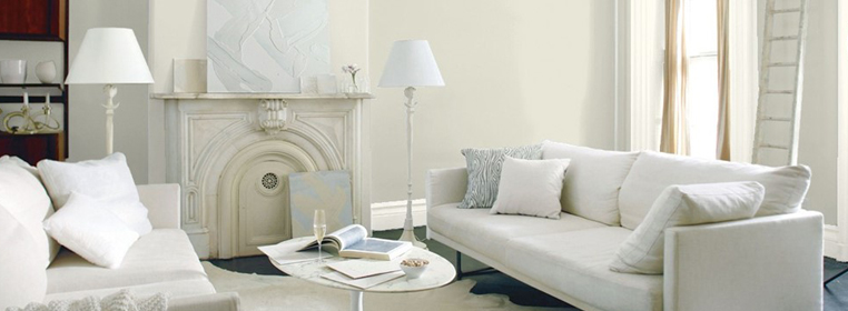
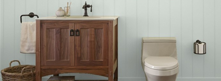
4. Steam
AF-15
A widely appealing white paint color that offers a clean yet soft look. This is an endlessly versatile choice.
5. Morning Dew
OC-140
A cool, soothing gray with a touch of green. Part of Benjamin Moore’s Classic Color Collection, this is a timeless and elegant shade.
6. Collector’s Item
AF-45
A pink-tinged off-white that provides a perfect backdrop for treasures in your home. Like its name suggests, we recommend adding this selection for bookcases, end tables, and any other wood project you might make and collect in your home.
7. Hint of Violet
AF-655
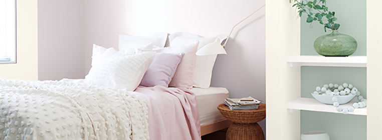
An eye-pleasing lilac with a cool gray cast. We think this is a pure and extraordinary color to compliment natural sunlight entering your rooms.
8. Mysterious
AF-565
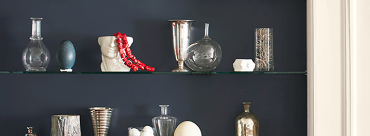
A compelling denim blue that can read as a black paint color or a rich navy. Whether you have a very contemporary home or more traditionally designed rooms, there’s no mystery that this hue works for both.
9. Quiet Moments
1563
A gentle mix of blue, green, and gray results in a color that exudes tranquility and inspires quiet meditation. A muted shade for muted moments.
10. Fernwood Green
2145-40
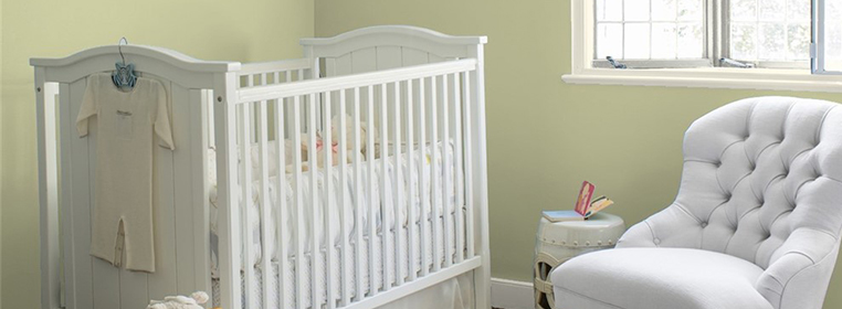
Warm undertones infuse this leafy green with calming comfort. Bring a touch of the natural world into your home with this great choice.
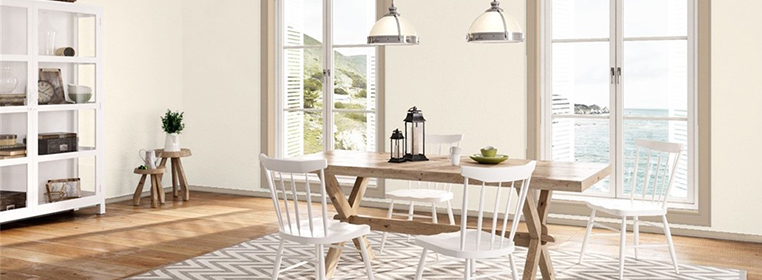
11. Natural Linen
966
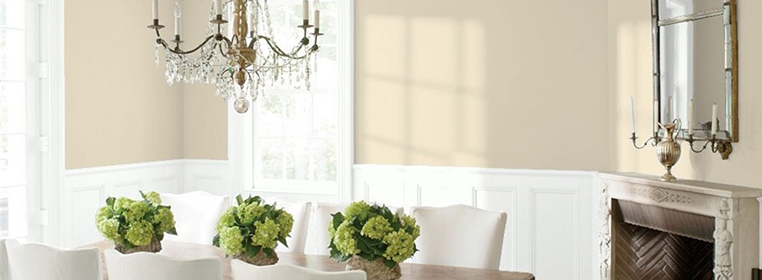
Like its namesake, this sandy neutral provides just the right amount of rustic warmth and elegance. It also adds a much loved softness to the look and vibe of any room it is in.
12. Venetian Portico
AF-185
A lush, earthy neutral that evokes sun-baked clay. Interior porches and rooms with skylights would really benefit in vibrance from this beautiful shade.
13. High Park
467
Gray undertones lend a sophisticated touch to this herbaceous green. We can’t help but think of how great this looks behind all of your indoor plants. A perfect compliment!
14. Gloucester Sage
HC-100
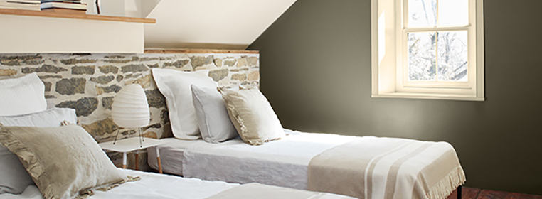
An adaptable dark hue that can conjure rain-soaked moss to elegant wrought iron. A classic feel that exudes a moody love for cool tones.
Need Help Finding Your Color?
There are many ways to choose the ideal color for your next paint project. Before you get started, visit our Paint Project page for expert insights and inspiration. If you’re looking to get creative and see what some of the above colors look like in your home, stop in to speak with our Paint Experts and we’ll be more than happy to help you create the perfect color scheme for your home.
Explore more of our Tips & Ideas